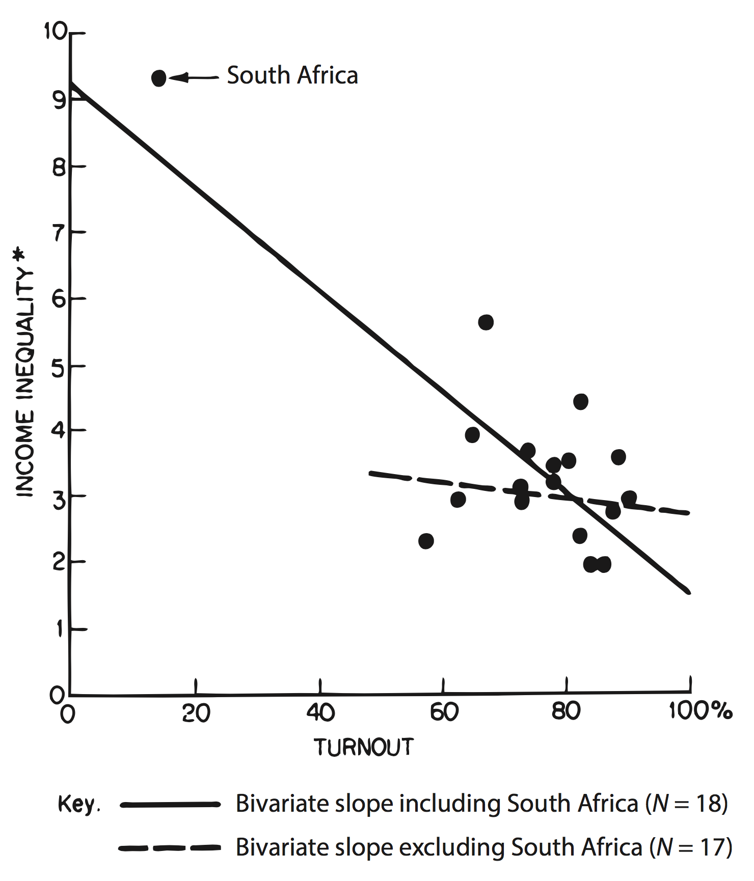
Are axes correct? (+ Should they have a zero-point?)
Do the colors work? ( + Do they map to a relevant attribute?)
Are all elements needed?
What is the data to ink ratio?
Is it understandable & simple?
Does it portray one conclusion?
Break
Code
library("RXKCD")RXKCD::getXKCD(which ="833")
Data Visualization Project 📊
Aims
Your goal is to go from exploring the Prowise data to telling a story with it.
Assignment 1: Choose a research question. Explore the data and create a set of visualizations to help you understand the data.
Assignment 2: Create a final data visualization that tells a story with the data. Compiled into a html document, and presented in a GitHub repository.
Requirements Assignment 2
Use R Markdown (or Quarto) to create your visualizations.
The markdown document should be in the style of a report: explain your research question, and how you came to your conclusion. Not more than 1000 words.
Include an exploratory graph, and explain how it helped you understand the data.
Only your final, explanatory graph, will be graded. Clearly mark which graph this is.
Workflow
Comment your code clearly. We want to understand your thought process.
Collaborate within your group using Git & GitHub. You will set up your own project repository connected to the Data Visualization Server.
Make sure all documents render correctly, and that code is styled and runs.
library("ggplot2")library("lubridate")fig_season_1 <- pizza_season %>%ggplot(aes(x = month, y = n, group = type)) +geom_bar(aes(fill = type), stat ="identity") +labs(title ="Pizza Season", subtitle ="2015", y ="Number of pizzas sold", x ="Month")fig_season_1
Code
fig_season_2 <- pizza_season %>%ggplot(aes(x = month, y = n, group = type)) +geom_line(aes(linetype = type)) +labs(title ="Pizza Season", subtitle ="2015", y ="Number of pizzas sold", x ="Month")fig_season_2
fig_season_2 +geom_line(linetype ="solid", color ="gray30", linewidth =0.5) +facet_wrap(~type) +theme_minimal(12) +theme(legend.position ="none",strip.text =element_text(face ="bold", color ="plum4"),strip.background =element_rect(fill ="thistle2", color =NA)) # fill for background; color for border
Colors
Code
fig_quarter <- pizza_season %>%mutate(quarter =case_when( month %in%c("Jan", "Feb", "Mar") ~"Q1", month %in%c("Apr", "May", "Jun") ~"Q2", month %in%c("Jul", "Aug", "Sep") ~"Q3", month %in%c("Oct", "Nov", "Dec") ~"Q4" )) %>%ggplot(aes(x = quarter, y = n, group = type)) +geom_bar(aes(fill = type), stat ="identity", position ="dodge") +labs(title ="Pizza Season", subtitle ="2015, split by quarter", y ="Number of pizzas sold", x ="")fig_quarter +scale_fill_viridis_d()
Color scales
Code
fig_quarter +labs(subtitle ="Qualitatitive Color Scale") +scale_fill_brewer(type ="qual")
qualitative
(categorical data)
Code
fig_quarter +labs(subtitle ="Sequential Color Scale") +scale_fill_brewer(type ="seq")
sequential
(ordered data that progress from low to high)
Code
fig_quarter +labs(subtitle ="Diverging Color Scale") +scale_fill_brewer(type ="div")
diverging
(ordered data that progress from low to high with a critical midpoint, e.g., 0)
sysfonts::font_add_google("Lobster")sysfonts::font_add_google("Lexend")showtext::showtext_auto()pizza_plot +# add a geom_rect element with opacity on top of pizza bars, to highlight the biggest bargeom_rect(data = pizza_totals %>%mutate(highlight =ifelse(type =="classic", TRUE, FALSE)),aes(xmin =0, xmax = total/1000, ymin =as.numeric(factor(type)) -0.5, ymax =as.numeric(factor(type)) +0.5,alpha = highlight),inherit.aes =FALSE,fill ="white" ) +scale_alpha_manual(values =c("TRUE"=0, "FALSE"=0.3), guide ="none") +labs(title ="The classic is a classic for a reason.",subtitle ="Total Pizza Sales in 2015",caption ="Source: pizzaplace dataset") +# change fontstheme(text =element_text(family ="Lexend", color ="gray30"),plot.title =element_text(family ="Lobster", size =20, color ="tomato3"),plot.subtitle =element_text(family ="Lexend", size =16), axis.title.x =element_text(family ="Lobster", size =16),axis.text.y =element_text(family ="Lobster", size =16, color ="tomato3"))
Consider your audience
Code
max_sales <-max(pizza_totals$total)best_seller <- pizza_totals$type[pizza_totals$total == max_sales]plot_data <- pizza_totals %>%# Create a logical column to highlight the best sellermutate(is_max = total == max_sales) %>%# Order the bars by total sales (optional, but professional practice)mutate(type = forcats::fct_reorder(type, total, .desc =TRUE))# Define the subtitlemain_conclusion <-paste0("The '", best_seller, "' pizza is the clear leader with ", scales::comma(max_sales), " units sold.")pizza_plot2 <-ggplot(plot_data, aes(x = type, y = total, fill = is_max)) +geom_col(width =0.7) +# Add labels above the barsgeom_text(aes(label = scales::comma(total)),vjust =-0.5, # Position the text slightly above the barsize =4, fontface ="bold" ) +# Apply manual colors: Highlight color for TRUE, Neutral gray for FALSEscale_fill_manual(values =c("TRUE"="tomato3", "FALSE"="grey70"), # Red for highlightguide ="none"# Remove the legend for the fill color ) +# Customize Titles and Labelslabs(title ="Total Sales by Pizza Type",subtitle = main_conclusion,x ="Pizza Type",y ="Total Units Sold" ) +# Apply a clean cowplot themetheme_cowplot() +# Remove y-axis clutter)theme(# Align and style title/subtitleplot.title.position ="plot",plot.title =element_text(size =16, face ="bold"),plot.subtitle =element_text(size =14, color ="grey30"),# Hide the y-axis line, ticks, and label as the data is already on the barsaxis.line.y =element_blank(),axis.ticks.y =element_blank(),axis.text.y =element_blank(),axis.title.y =element_blank(),# Add a faint grid line (a cowplot feature)panel.grid.major.y =element_line(color ="grey90", linetype ="dashed") ) +# Ensure there is enough room for the labels on topscale_y_continuous(expand =expansion(mult =c(0, 0.15)))# Print the final plotpizza_plot2
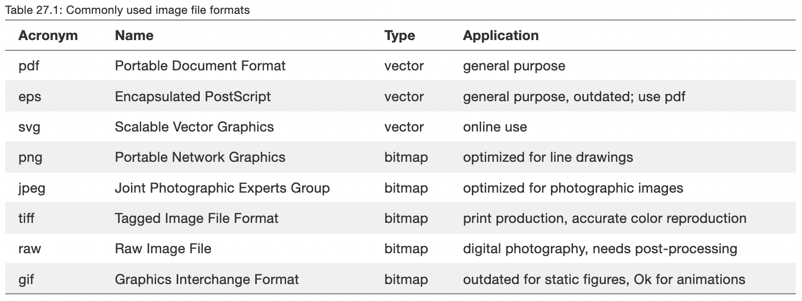
File format/size
File size: email attachment, webpage/image load time, compilation time
File format: resizing vector vs. bitmap/raster. For bitmap images, set the plot resolution: dpi = c(“retina”, “print”, “screen”)
Vector images pick the closest font available (if the actual font is not available on the recipients computer). You can embed fonts into the vector image.